What we did
We started sketching early on to better understand what kinds of health and personal data is recorded about patients and what it looks like.
A lot of the data is displayed in text so we also started experimenting by writing text in different tones. Sketches with drawings and words was a useful way for us to explore the problem space through making.
Alongside this more playful work, we were referring to the user research. As a team, we discussed the research in weekly meetings and drew more insights from the research.
This is when we started to draw out our experience map, which helped us to describe someone's life with a collaborative health information system.
The experience map
Experience mapping is a useful way to understand how services work in the real world. The collaborative health information system is not a single application or website but a set of tools and information that will come together in different ways to create a service for patients, carers, clinicians and healthcare workers.
Designing a flexible service like this is more than simply a set of pages, screens or components; it's important to understand how information should move around, what different users will need at different moments, and how the experience of using the service will change as a person's life becomes more or less complicated. It's also useful to consider different points of a person's engagement: how they begin to use it, and why; the most complex and difficult moments they are likely to experience; and - in this care - what happens when someone dies, or gets better.
To see what would be most useful, we used the insights from the user research and from there constructed a map of what one person's experience with health and social care might look like in the last phases of life.
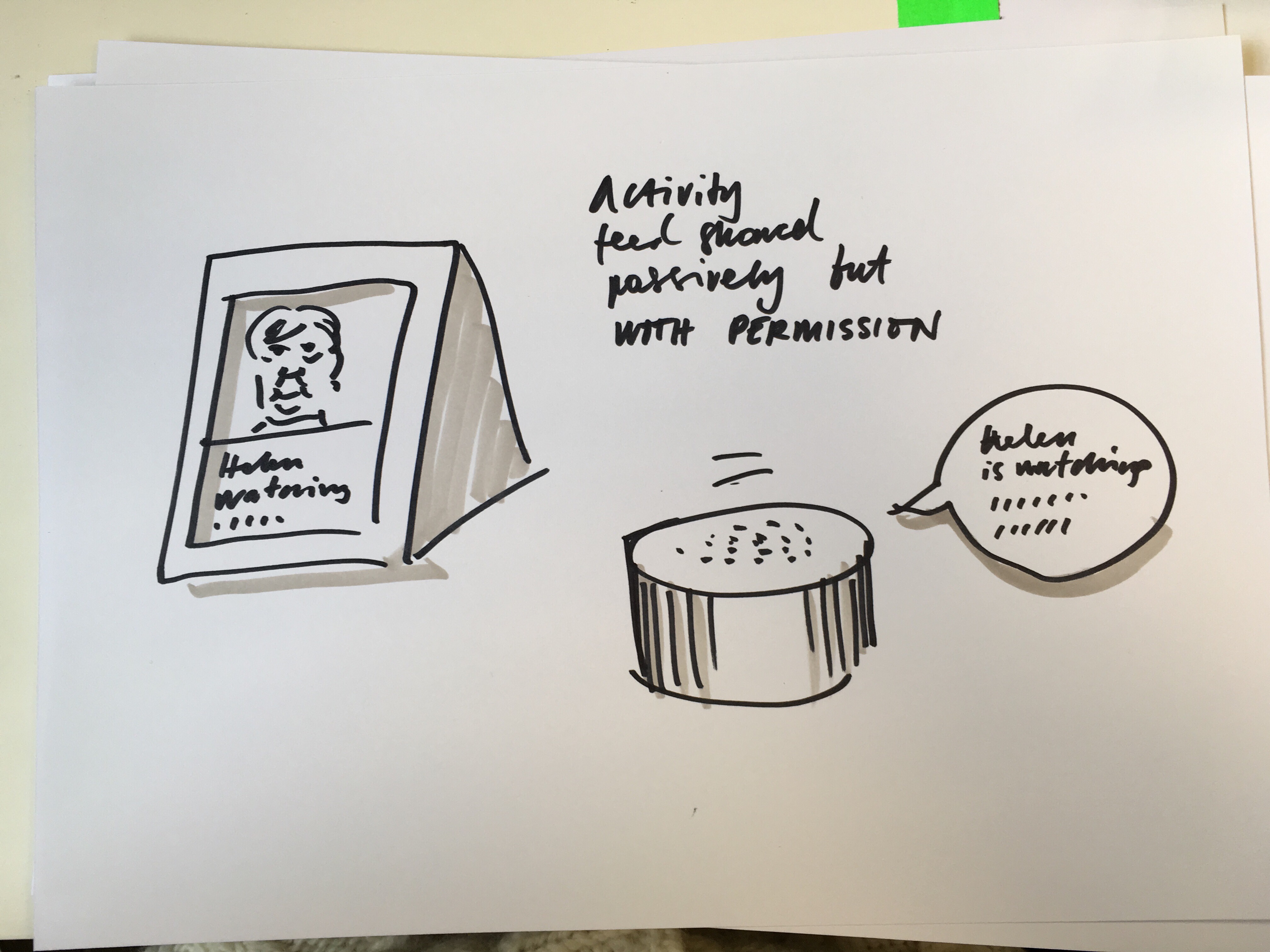
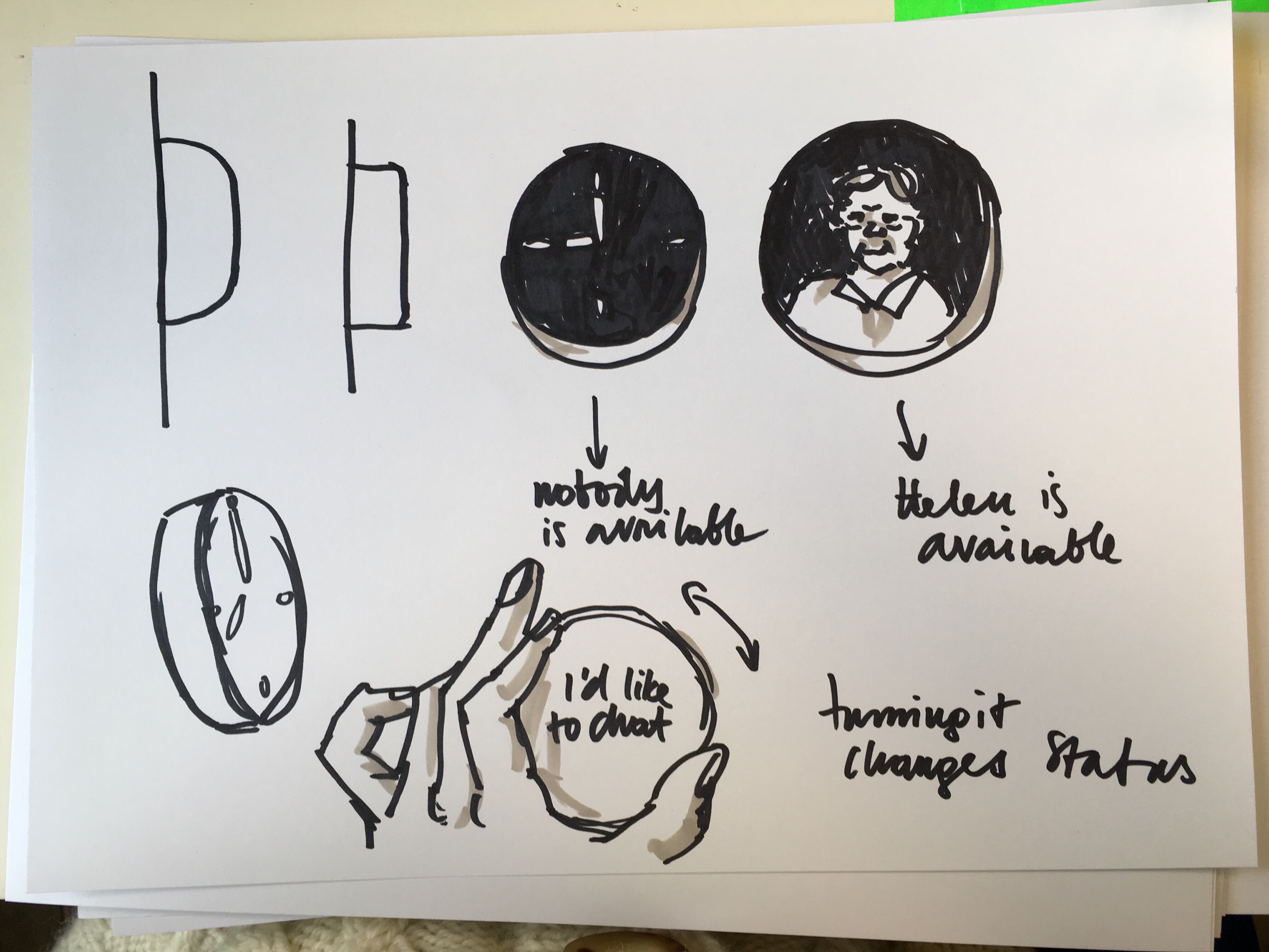
We plotted their gradual decline with heart failure and Alzheimer's, and how that would impact on the quantity of health data they had and who was caring for them. We then attached the user research insights into particular moments on the map where we felt a different kind of collaborative information system could help.
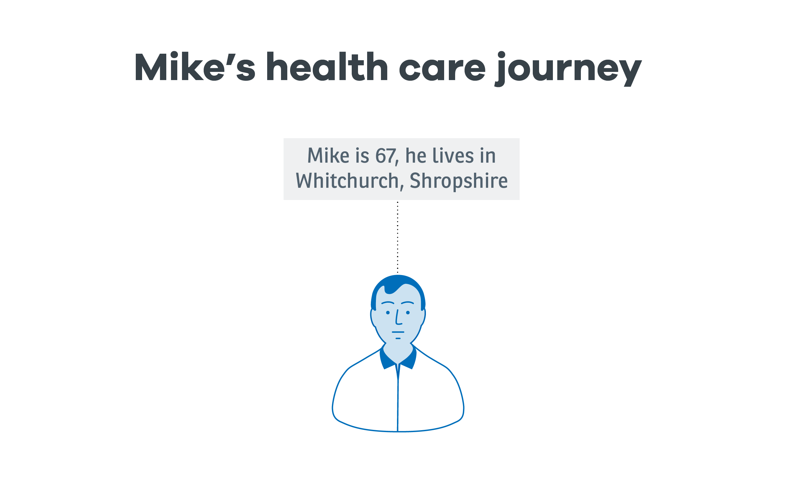
Mike's health care journey
Here are some extracts from the experience map.
We started by understanding more about Mike. Looking at his life and habits, it was obvious he wouldn't have much motivation to look at his health records or actively manage his health information when he was well.
So it was more realistic to begin his interactions with the service at the point of his first diagnosis.
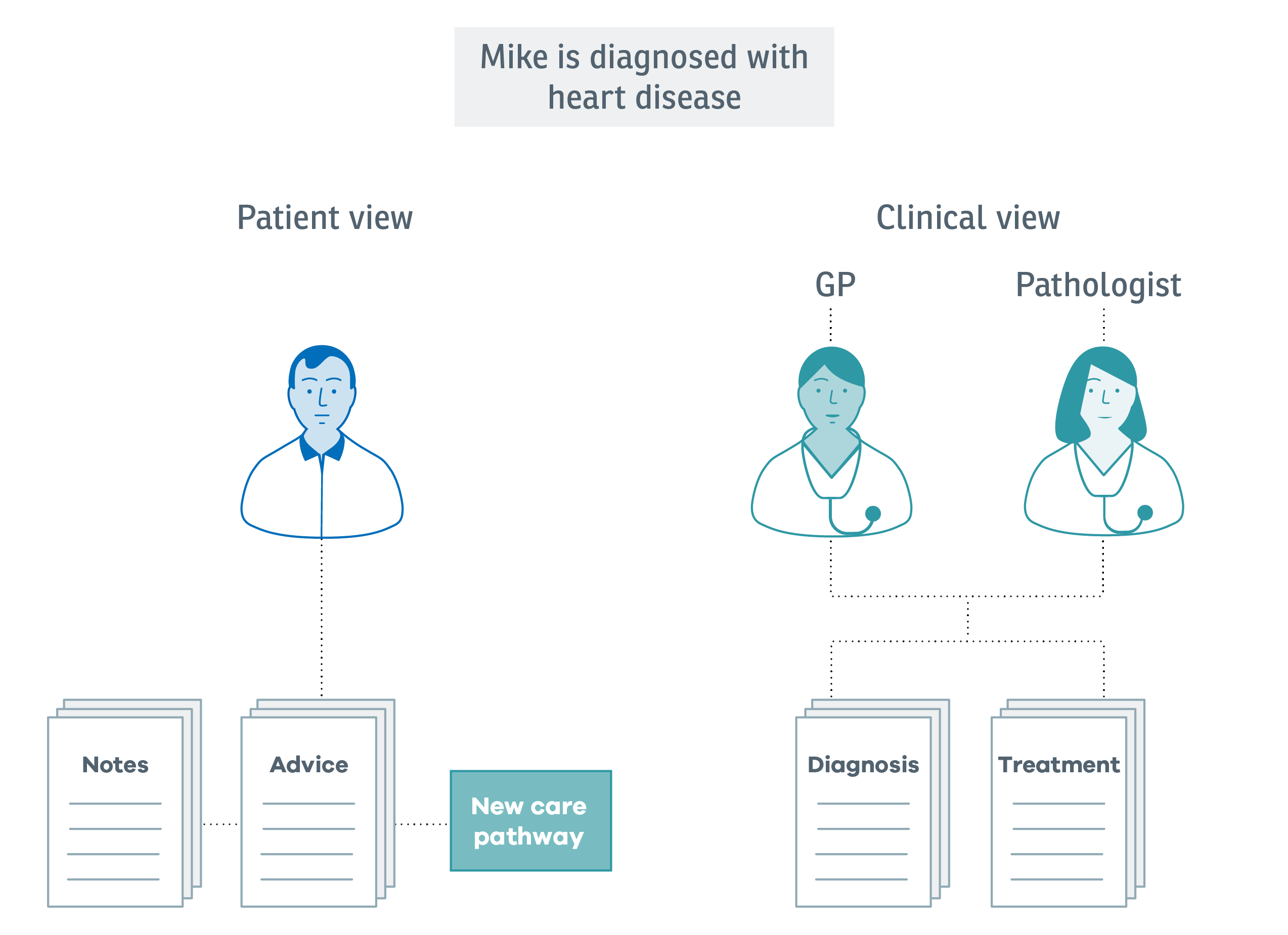
After Mike's initial diagnosis with heart disease, he manages most of his own interactions with health and social care, but as his care plan changes, family members become more involved.
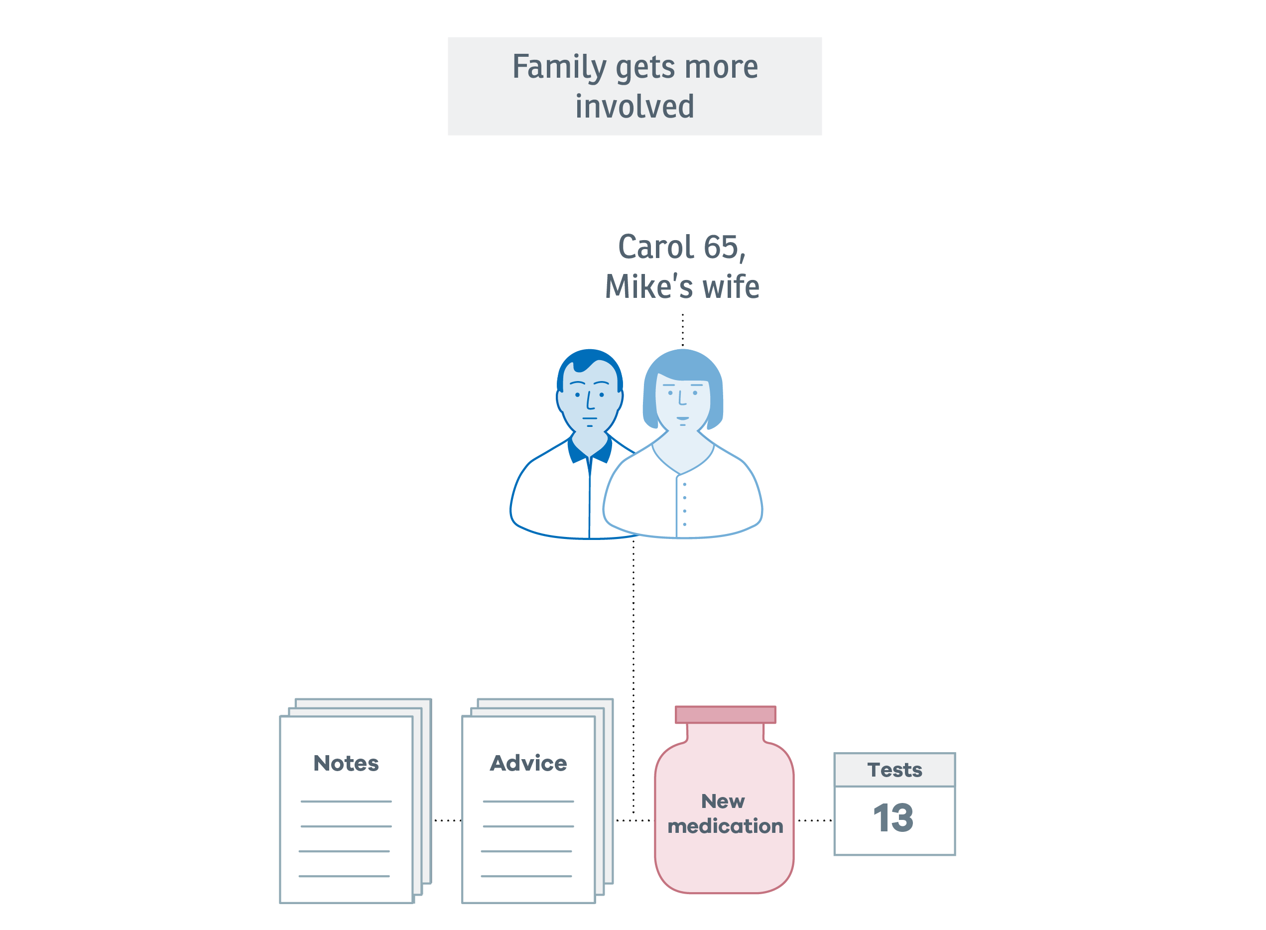
As Mike begins to have more tests and his medication changes, his wife Carol receives access to the service, so she can chase test results, see when Mike's next appointment will be, and keep track of new prescriptions.
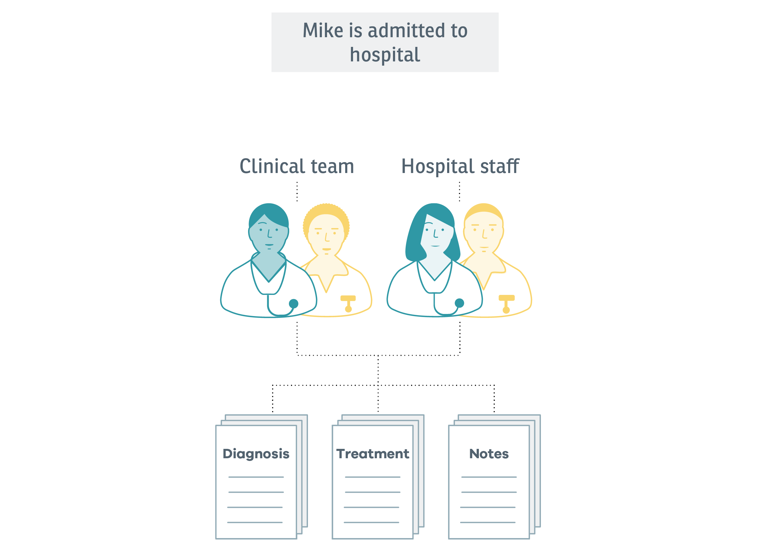
When Mike is admitted to hospital following a complication, the frequency of new information about him increases and more clinicians are involved in his care. Up-to-date, accurate information is essential for everyone, including Mike and Carol.
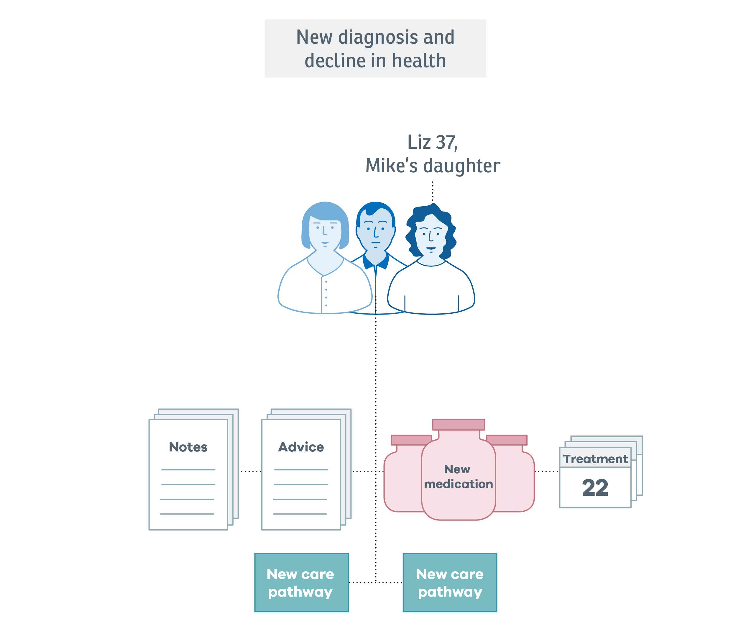
A while later, Mike is diagnosed with a second illness. Carol needs more support from their daughter Lix, and Liz wants to keep track of chages to Mike's care plan.
As Mike's condition worsens, his medication becomes more complex and he begins to receive palliative care.
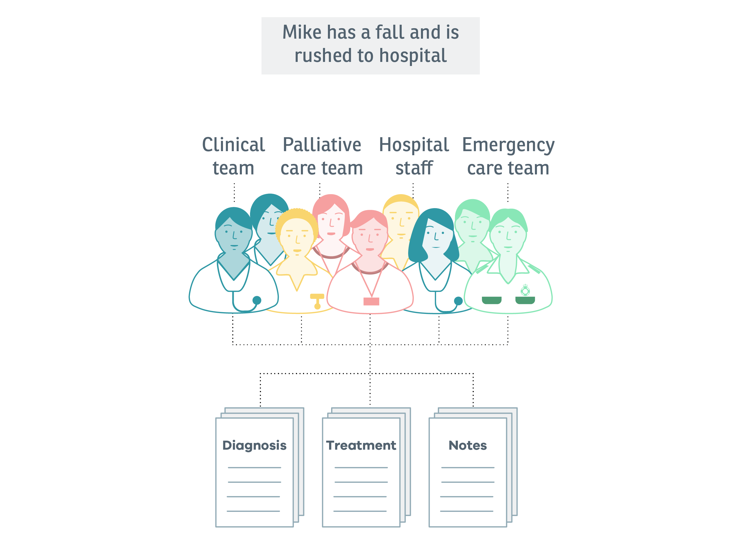
Mike is still living at home and is becoming more dependent on Carol. One day, while going to the bathroom, he falls at the top of the stairs. Carol calls an ambulance and Mike is taken to hospital.
Developing the experience map has shown some of the most important parts of the service to design, and illustrated some of the most complex permissions and data flows. This has formed the basis of the prototyping.